Chart Types: Essential Visual Tools for Forex Trading Analysis
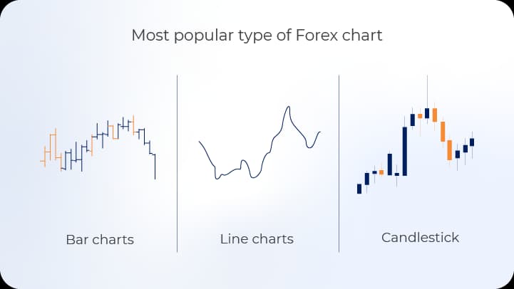
Chart types represent distinct methodologies for visualizing financial market data, enabling traders to interpret price movements, volume patterns, and market trends with precision. Understanding the structural differences between line charts, bar charts, and candlestick charts equips forex traders with the analytical framework necessary to make informed decisions based on historical price action and emerging market dynamics.


What Are Chart Types?
Chart types constitute the foundational visual representations used in technical analysis to display price data across various timeframes. Each chart type organizes market information differently, emphasizing specific aspects of price behavior that serve distinct analytical purposes. The selection of chart type influences how traders perceive market structure, identify patterns, and formulate trading hypotheses.
In forex trading contexts, chart types transform raw numerical data into visual formats that reveal relationships between price, time, and market psychology. As core components of technical analysis methodology, these graphical representations enable pattern recognition that would remain obscured in tabular data formats, facilitating faster decision-making during active trading sessions.
Key Takeaways
- Line charts provide simplified trend visualization by connecting closing prices, making them ideal for identifying long-term directional movements and support/resistance levels
- Bar charts deliver comprehensive price information within each time period, displaying opening, high, low, and closing values to reveal intraday volatility and market sentiment
- Candlestick charts enhance visual pattern recognition through color-coded bodies and shadows, allowing rapid identification of reversal signals and continuation patterns
- Selecting appropriate chart types depends on trading timeframe, strategy requirements, and the specific market information needed for decision-making
- Combining multiple chart types creates layered analytical perspectives that strengthen trade validation and risk assessment
Line Charts: Simplicity in Trend Identification
Fundamental Characteristics
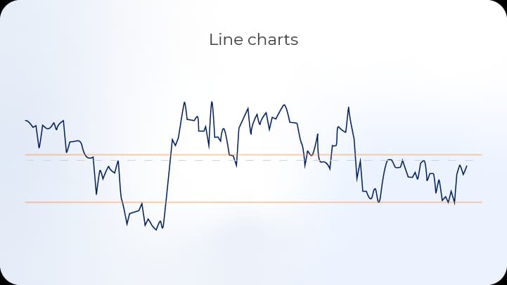
Line charts represent the most elementary form of price visualization, constructed by connecting sequential closing prices with a continuous line. This methodology eliminates intraday price fluctuations, focusing exclusively on where each trading period concludes. The resulting visual simplicity makes line charts particularly effective for identifying overarching trends without the distraction of short-term volatility.
The construction of line charts follows a straightforward principle: each data point corresponds to the closing price of a specific timeframe, whether that represents one minute, one hour, one day, or longer periods. The continuous connection between these points creates a flowing representation of price trajectory over time.
Applications in Forex Trading
Line charts serve multiple analytical functions within forex trading strategies. Primary applications include long-term trend analysis, where the smoothed representation clarifies directional bias over extended periods. Traders employing position trading strategies or conducting weekly and monthly timeframe analysis frequently utilize line charts to avoid overemphasis on short-term noise.
Support and resistance level identification benefits from line chart clarity, as horizontal price zones become more apparent without the visual complexity introduced by bars or candlesticks. The continuous line format allows traders to draw trendlines with greater ease, connecting swing highs or swing lows to establish channels and trend angles.
Limitations and Considerations
Despite their utility, line charts omit critical information that other chart types preserve. The absence of opening prices, intraday highs, and intraday lows removes visibility into volatility and price rejection zones. Traders cannot assess whether periods of consolidation involved significant testing of levels or merely represented narrow-range trading.
Pattern recognition capabilities remain limited with line charts, as many technical patterns require knowledge of opening, high, low, and closing prices for proper identification. Candlestick patterns, gaps, and bar formations cannot manifest in line chart representations, restricting the analytical toolkit available to the trader.
Bar Charts: Comprehensive Price Information
Structural Components
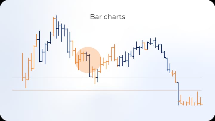
Bar charts, also known as OHLC (Open-High-Low-Close) charts, present four distinct price points for each time period through vertical bars and horizontal tick marks. The vertical line spans from the period's lowest price to its highest price, representing the complete trading range. A horizontal tick extending left indicates the opening price, while a tick extending right marks the closing price.
This structural design conveys substantially more market information than line charts, allowing traders to assess volatility magnitude, directional momentum, and the relationship between opening and closing prices. The visual weight of each bar corresponds directly to price range, making volatile periods immediately distinguishable from consolidation phases.
Analytical Advantages
Bar charts facilitate detailed analysis of price action characteristics within each timeframe. The relationship between opening and closing prices reveals buying or selling pressure, with closes near highs suggesting bullish sentiment and closes near lows indicating bearish pressure. The length of wicks (the portions of the bar extending beyond the open-close range) demonstrates price rejection and the presence of countertrend forces.
Intrabar volatility becomes quantifiable through bar range measurement, enabling traders to identify expansion and contraction cycles that often precede significant directional moves. False breakouts become visible when bars extend beyond support or resistance levels but close back within prior ranges, signaling potential traps rather than genuine breakouts.
Pattern Recognition Capabilities
Bar charts support identification of numerous price action patterns essential to technical analysis. Inside bars, outside bars, and pin bars represent specific formations that signal potential reversals or continuations based on their location within broader market structure. These patterns emerge from the relationships between consecutive bars' high-low ranges and open-close positions.
Range analysis becomes more precise with bar charts, as traders can measure average true range (ATR) and identify periods where current volatility deviates significantly from historical norms. Such deviations often precede breakouts or reversals, making bar chart analysis valuable for timing entry and exit decisions.
Comparative Analysis Table
Chart ElementLine ChartBar ChartCandlestick ChartClosing PriceDisplayedDisplayedDisplayedOpening PriceNot shownDisplayedDisplayedHigh PriceNot shownDisplayedDisplayedLow PriceNot shownDisplayedDisplayedVisual ClarityExcellentModerateExcellentPattern RecognitionLimitedComprehensiveComprehensiveColor CodingMinimalOptionalStandardTrend VisualizationExcellentGoodExcellentVolatility AssessmentPoorExcellentExcellent
Candlestick Charts: Enhanced Visual Communication
Historical Development and Structure
Candlestick charts originated in 18th-century Japanese rice trading, developed by Honma Munehisa to track price movements in the Dojima Rice Exchange. This methodology gained international recognition through Steve Nison's introduction to Western markets in the 1990s, subsequently becoming the predominant chart type in forex trading platforms.
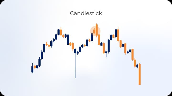
The candlestick structure consists of a rectangular body and thin lines called shadows or wicks extending from the body's top and bottom. The body represents the range between opening and closing prices, with color indicating directional outcome—typically green or white for periods where closing exceeded opening (bullish), and red or black for periods where closing fell below opening (bearish).
Shadows extend from the body to the period's absolute high and low prices, visualizing the complete price excursion and areas of rejection. This design enables rapid assessment of both the period's ultimate outcome and the intraperiod struggle between buyers and sellers.
Pattern Recognition Systems
Candlestick charts support an extensive pattern recognition framework, encompassing single-candle, dual-candle, and multi-candle formations. Single-candle patterns include doji (open equals close), hammer (small body with long lower shadow at downtrend bottom), and shooting star (small body with long upper shadow at uptrend peak).
Dual-candle patterns such as engulfing formations (where the second candle's body completely encompasses the first) and piercing patterns (bullish reversal where second candle opens below prior low but closes above prior midpoint) provide reversal signals based on the relationship between consecutive periods. Multi-candle patterns like morning star and evening star formations indicate major reversal potential through three-candle sequences.
Psychological Interpretation
Candlestick formations communicate market psychology through visual representation of supply-demand dynamics. Long bullish bodies indicate sustained buying pressure throughout the period, while long bearish bodies reflect persistent selling. Small bodies with long shadows demonstrate indecision, with neither buyers nor sellers establishing control.
The location of closing prices within the candle's range provides insight into conviction levels. Closes near highs after upward movements or near lows after downward movements suggest strong directional commitment, while closes near period midpoints indicate hesitation or balance between opposing forces.
Integration with Technical Analysis
Candlestick patterns gain significance through context within broader market structure. Reversal patterns appearing at established support or resistance levels carry greater predictive weight than identical formations in mid-trend locations. Confirmation through subsequent price action strengthens pattern validity, with traders typically waiting for follow-through before committing capital.
Volume analysis complements candlestick interpretation, as patterns accompanied by above-average volume demonstrate broader market participation and increased reliability. Divergences between price patterns and volume trends may signal false signals or weakening momentum despite apparent directional clarity.
Comparative Chart Type Selection
Timeframe Considerations
Chart type appropriateness varies with trading timeframe and strategic approach. Scalpers operating on one-minute to five-minute timeframes typically prefer candlestick charts for rapid pattern recognition during high-frequency decision-making. The visual clarity of colored bodies enables split-second assessment of momentum shifts and reversal signals.
Day traders utilizing 15-minute to hourly charts benefit from either bar or candlestick representations, depending on personal preference and pattern familiarity. Both formats provide the comprehensive price information necessary for intraday pattern recognition and volatility assessment. Line charts rarely serve day trading purposes due to information insufficiency.
Swing traders analyzing daily and four-hour charts commonly employ candlestick charts for pattern identification while occasionally referencing line charts to clarify multi-week or multi-month trends. The dual-chart approach balances detailed pattern analysis with simplified trend perspective, preventing overemphasis on short-term fluctuations when holding positions for days or weeks.
Position traders focusing on weekly and monthly timeframes may utilize line charts for primary trend identification, supplementing with candlestick charts when refining entry timing. The extended holding periods associated with position trading make intraday volatility less relevant, emphasizing overall directional clarity over granular price action details.
Strategic Compatibility Assessment
Trading StrategyRecommended Primary ChartSecondary Chart OptionRationaleScalpingCandlestickBarRapid pattern recognition with visual clarityDay TradingCandlestick/BarLine (higher timeframe)Comprehensive intraday information with trend contextSwing TradingCandlestickLine (weekly/monthly)Pattern-based entries with long-term trend alignmentPosition TradingLineCandlestick (entry timing)Trend focus with tactical entry refinementBreakout TradingCandlestickBarVolatility assessment and false breakout identificationReversal TradingCandlestickCandlestick (multiple timeframes)Pattern-dependent strategy requiring detailed formations
Platform and Display Considerations
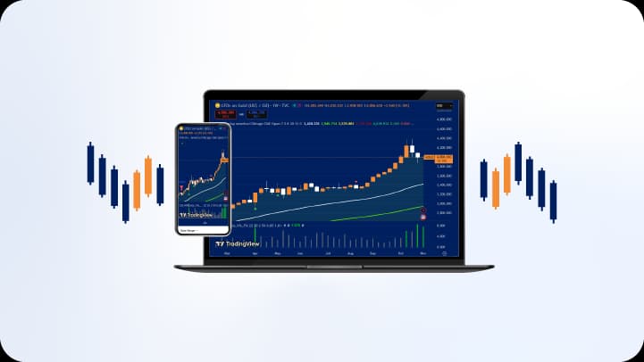
Modern trading platforms offer customizable chart settings that influence visual interpretation. Candlestick color schemes vary across platforms, with some defaulting to green/red combinations while others use white/black or blue/orange. Traders should maintain consistent color associations to prevent confusion during rapid decision-making.
Screen size and resolution affect chart type effectiveness, as candlestick charts displaying numerous periods on small screens may become visually cluttered. Line charts maintain clarity across display formats, making them suitable for mobile trading applications or quick reference checks. Bar charts occupy middle ground, providing comprehensive information while maintaining reasonable visual density.
Advanced Chart Type Applications
Multi-Timeframe Analysis
Professional traders frequently employ multiple chart types across different timeframes simultaneously, creating layered analytical frameworks. A common approach involves using line charts on daily or weekly timeframes to establish primary trend direction, while relying on candlestick charts on hourly or four-hour timeframes for entry and exit timing.
This multi-timeframe methodology prevents conflicting signals that arise when analyzing single timeframes in isolation. Traders ensure that short-term position entries align with longer-term trend directions, reducing the frequency of counter-trend trades that face greater probability of failure.
Chart Type Combinations for Confirmation
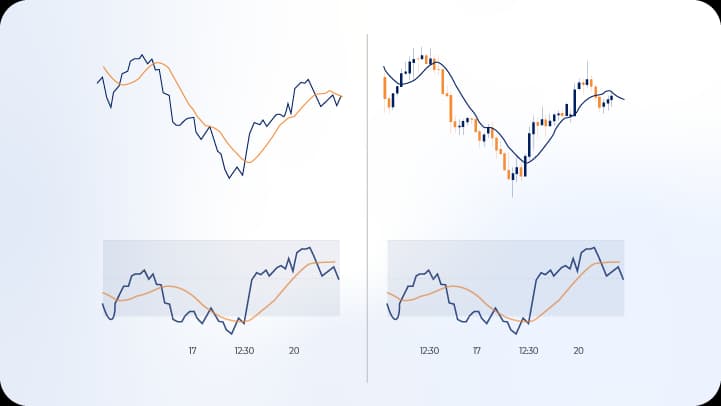
Some advanced practitioners overlay simplified chart representations onto detailed charts, creating hybrid visualizations. For example, plotting a line chart's trend alongside candlestick price action helps maintain focus on overall direction while analyzing specific entry patterns. This approach prevents the common trading error of becoming fixated on short-term patterns that contradict established trends.
Similarly, comparing bar chart and candlestick chart interpretations of identical data provides confirmation of pattern validity. When both chart types suggest similar conclusions regarding support, resistance, or pattern formation, conviction levels increase appropriately.
Specialized Chart Variations
Beyond standard line, bar, and candlestick formats, specialized variations serve niche analytical purposes. Heiken-Ashi candlesticks smooth price data by calculating modified open, high, low, and close values, creating charts that filter market noise and clarify trend direction. However, these modifications delay signals and may obscure important price levels.
Renko charts eliminate time as a variable, creating new bricks only when price moves a specified amount, effectively filtering insignificant movements. Point and figure charts similarly focus on price changes rather than time progression, creating columnar representations of upward and downward movements. These alternative formats serve specific analytical purposes but lack the universal adoption of standard chart types.
Technical Implementation and Best Practices
Chart Configuration Optimization
Proper chart configuration enhances analytical effectiveness regardless of chart type selected. Timeframe selection should align with trading strategy duration, with intraday traders analyzing multiple short-term timeframes and position traders emphasizing daily, weekly, and monthly charts. Displaying too many periods on screen reduces pattern visibility, while too few periods removes necessary context.
Grid lines and price scales require careful adjustment to balance information provision with visual clarity. Dense grid patterns create clutter, while complete absence of reference lines complicates level identification. Price scale positioning on the right side of charts follows market convention, with automatic scaling ensuring current price action remains visible without manual adjustment.
Indicator Integration Considerations
Technical indicators applied to different chart types produce identical mathematical results but may appear visually distinct due to underlying price representation. Moving averages applied to line charts connect smoothly, while the same indicators on candlestick charts may appear choppier due to increased data granularity visible in the underlying price action.
Oscillators and momentum indicators function identically across chart types, as these calculations derive from closing prices or OHLC data regardless of visual representation. Traders should recognize that chart type selection affects visual interpretation more than indicator calculation, with consistency in chart type preventing confusion when pattern and indicator signals converge.
Common Configuration Errors
Several configuration mistakes diminish chart type effectiveness. Excessive compression—displaying too many periods in limited screen space—makes pattern identification difficult and increases error probability. Conversely, excessive expansion showing too few periods removes essential context regarding prior support, resistance, and trend structure.
Color scheme mismatches between bullish and bearish periods can create interpretive errors, particularly when switching between platforms or sharing analysis with other traders. Standardizing color associations across all charts and timeframes prevents directional confusion during rapid market movements.
Conclusion
Chart types constitute essential tools within the forex trader's analytical framework, with line charts, bar charts, and candlestick charts each offering distinct advantages for specific purposes. Line charts excel at trend identification and long-term analysis through their simplified representation, while bar charts provide comprehensive OHLC data supporting detailed volatility and range assessment. Candlestick charts combine comprehensive information with enhanced visual pattern recognition, making them the predominant choice for short-term and medium-term technical analysis.
Effective chart type selection depends on trading timeframe, strategic requirements, and personal analytical preferences developed through experience. Multi-timeframe analysis incorporating different chart types creates robust analytical frameworks that balance detailed pattern recognition with broader trend perspective. Traders who master interpretation across multiple chart formats gain flexibility to adapt their analysis to varying market conditions and strategic objectives.
The ongoing evolution of trading technology continues expanding chart customization options, yet the fundamental principles underlying line, bar, and candlestick representations remain constant. Developing proficiency with these core chart types establishes the foundation for advanced technical analysis and informed trading decisions within dynamic forex markets.
