
Types of price charts in forex
Forex traders use three main chart types: line, bar, and candlestick. Line charts show only the closing price. Bar and candlestick charts show the full range of each period, open, high, low, and close. Advanced charts like Heiken-Ashi and Renko filter price data further to reduce noise. Each type shows the same market differently, and the one you choose will directly affect how you read price behavior and time your entries.
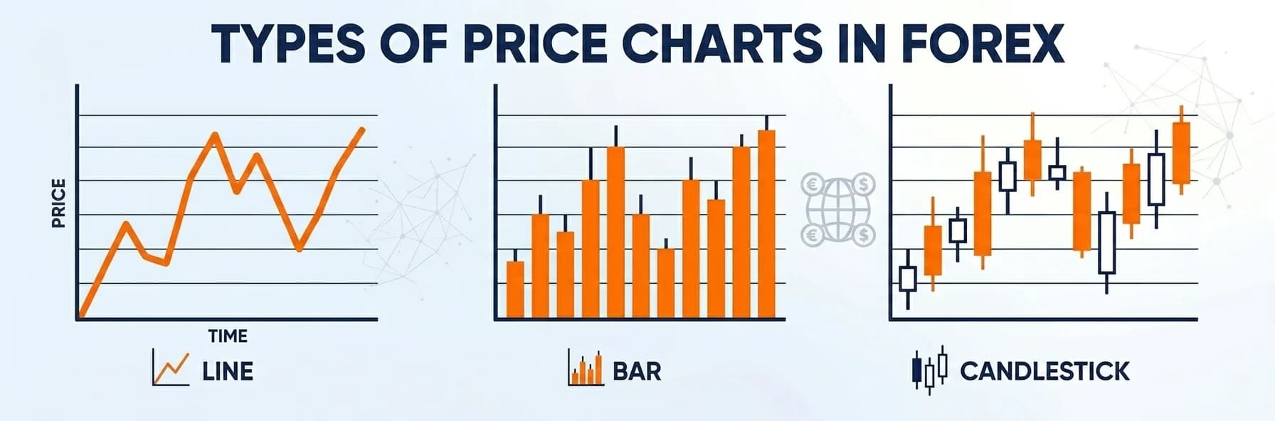
There are three main types of price charts used in forex: the line chart, the bar chart, and the candlestick chart. Beyond these, traders who need to filter noise from their analysis use advanced charts such as Heiken-Ashi and Renko. Each type presents price data differently, and the chart you choose will shape how you read market structure, spot key levels, and time your entries.
For experienced traders, the choice often comes down to what the chart reveals about price behavior at the moment it matters most. A 5-minute candlestick chart, for instance, will show you the shadow that forms when price rejects a key level, the exact signal that is invisible on a line chart of the same move.
Types of price charts
There are a wide range of charts in the forex market to show price changes over time, which are divided into three general categories: basic, intermediate, and advanced charts which are explained at the rest. For anyone Learning Forex, understanding these chart types is crucial to building a solid trading foundation.
Basic charts
As the name suggests, charts in this category are the simplest possible charts. These charts are divided into 3 types of tick, line and bar charts. In tick chart, the number of trades is depicted in each time frame. For example, a 1000 tick chart shows every thousand transactions in one tick. Contrary to the fact that this type of chart is in the basic category, its interpretation is not so simple.
Another type of chart in this category is a line chart. The line chart is the most basic form to draw the price in the financial market and it can be said that it is one of the simplest types of forex charts and it is their main advantage. This is a line that connects prices to each other over time.

There is another type of basic price chart called a bar chart. The bar chart is the closest form to the most popular chart in the forex market, the candlestick chart. Unlike a line chart, a bar chart shows all price movements over a period. High, low, open and close prices play an essential role in the formation of a bar chart.

Intermediate level charts
The most important type of price chart in this category are candlestick charts. This type shows all changes and movements of the price from the opening price, the highest and the lowest price to the closing price.
Many beginners subconsciously think of Wall Street when it comes to trading the forex market. It is true that many of today's styles of financial market analysis were founded in America. But it is interesting to know that one of the main tools of today's technical analysis was invented centuries ago in Japan, which is the candlestick price chart, which is currently considered an inseparable element of financial market analysis.

Advanced charts
For traders looking for technical analysis in a more professional manner, there are other more advanced charts, the most important of which are: Heiken-Ashi, Renko and
point-shape charts. Experienced traders use this type of price chart to filter out false breakouts and detect incorrect market movements.

Forex price chart types compared
Not all forex charts show the same information. Line charts plot only the closing price, which keeps the view clean but removes intraday detail. Bar and candlestick charts include open, high, low, and close in every period. Advanced charts like Heiken-Ashi and Renko go further and filter the data itself before displaying it. The table below breaks down how each chart type differs across the factors that matter most when choosing one for your trading setup.
| Chart type | Price data shown | Best use case | Suited for | Common timeframe |
|---|---|---|---|---|
| Line | Close only | Trend direction, clean pattern reading | Beginners, macro analysis | Daily, weekly |
| Bar | Open, high, low, close | Full price range per period | Intermediate traders | 1H, 4H, daily |
| Candlestick | Open, high, low, close | Price action, entry signals, rejection patterns | All levels | All timeframes |
| Heiken-Ashi | Modified OHLC average | Trend filtering, noise reduction | Trend traders | 4H, daily |
| Renko | Price movement only (no time) | Filtering sideways movement, breakout detection | Experienced traders | Time-independent |
Which chart type is best for forex trading?
For most forex traders, the candlestick chart is the best starting point and, for many, the only chart they ever need. It shows the full range of price movement in every period, open, high, low, and close, and it reveals the behavior of price at key levels in a way that line and bar charts do not.
The detail that matters most is the shadow. When price approaches a significant level and a candle forms with a visible shadow on top, it means the market tested that level and rejected it. That rejection is not visible on a line chart. On a bar chart it is present but harder to read at a glance. On a candlestick chart it stands out immediately, and that speed of recognition matters when you are making a decision in real time.
This is not just theory. A 5-minute XAU/USD candlestick chart is the basis of a scalping setup built around Higher High rejections, where a bullish candle with a shadow at last week's higher high, followed by a bearish candle, signals a short entry. That specific setup, run consistently on gold over two years, grew a $5,000 account to over $70,000. The candlestick chart made that setup readable. A line chart of the same price action would have shown nothing actionable at the moment of entry.
That said, the right chart also depends on how you trade. Trend traders who want to remove short-term noise often switch to Heiken-Ashi because it smooths each candle using an average of the open, high, low, and close, making the direction of a trend easier to hold through minor pullbacks. Renko charts go further and remove time from the chart entirely, only printing a new block when price moves a set distance. This makes them useful for spotting breakouts without the distraction of low-volume sideways sessions.
If you are new to technical analysis, start with candlestick charts on a timeframe that matches how long you plan to hold a trade. If you scalp, use the 1-minute or 5-minute chart. If you swing trade, use the 4-hour or daily. The chart type matters less than your consistency in reading it.
Using candlestick charts to analyze prices
As mentioned before, candlestick charts are one of the most common types of price charts that traders use for conducting price studies and technical analysis.
To clarify the details of this type of chart and how to work with it, pay attention to the image below. A candlestick consists of three parts: the body, the lower shadow, and the upper shadow. In general, we have two types of candles: bullish and bearish. Bullish candles are often displayed in blue or green, while bearish candles typically appear in red.
In a bullish candle, the opening price is lower than the closing price, and the opposite is true for a bearish candle. The upper and lower shadows represent the highest and lowest prices reached during the formation of the candle. Because candlestick charts reveal many intricate details of price movements, they remain one of the most widely used tools in the forex market.
Many traders further enhance their analysis by integrating advanced strategies, such as the Smart Money Concept (SMC) Forex Strategy. This approach builds on the insights gained from candlestick patterns by examining market structure, liquidity pools, and order flow to uncover where institutional players the so-called “ smart money ” are likely positioning their trades.
When specific candlestick patterns emerge, the SMC strategy can help traders interpret these signals in the context of broader market dynamics, potentially indicating key reversal zones or trend continuations. In this way, the combination of traditional candlestick analysis with SMC provides a more robust framework for understanding market behavior and making informed trading decisions.

Why the shadow candle is the most important signal on a candlestick chart
The body of a candlestick tells you where the open and close of the price were for that candle. The shadows of a candlestick, on the other hand, tell you where the market tried to go and failed.
A candle with a long upper shadow indicates that the price of the security has hit a significant level and been rejected by buyers or sellers. The upper shadow of the candle is a print of the rejection at that price level. It is not a pattern and does not need to be read as such.
The benefit of viewing a candlestick chart as opposed to a line chart or bar chart at the point of entry is greater than any other application. A line chart for example would only illustrate the closing price for a given period of time. A bar chart would illustrate the same information but unfortunately it does not clearly or quickly delineate the relationship between the open, the close and the body down of an upwards or downwards moving line. A candlestick chart however clearly and quickly illustrates a long upper shadow above a known level of resistance for example within a matter of seconds.
You see the price of XAU/USD going strongly up to last week’s high of the higher high level. A strong bullish candle forms with an upper shadow (shadow above the level of resistance). The candle of the next day is going down bearish. That is the trade. A shadow candle followed by a bearish confirming candle at a crucial price level on a 5-minute chart is one of the most repeating rejection trades on the above mentioned time frame. Because the shadow of a candlestick does not tell you anything about the market, only what some big players did at a specific price. As a trader you can see the shadow of a candle (the upper shadow in this case) and recognize the setup.
Switching from line charts to candlestick charts in order to read out prices on the 5-minute chart typically gives the trader a much greater appreciation for the detail of the price’s shadow. While a line chart simply prints the closing price of the period, and a bar chart prints the open, close, as well as the high/low for the period, the shadow on a candlestick chart shows the amount of detail that the price has in reading it. In reality the shadow is not difficult to read; in fact it is easily read in under a second. And as soon as a trader reads the detail of the price’s shadow in reading price on a candlestick chart, they cannot unsee it reading price on a line or bar chart.
Related Guide: Candlestick Patterns: A Complete Guide for Forex Traders
How to interpret moving averages?
Moving average is usually one of the first types of indicators that a professional trader gets to know. The moving average is a chart whose points are obtained from the average prices of several time periods.
Suppose a 14-period moving average. This means that each point of the moving average chart is the result of the average price of the previous 14 periods. These prices in the last 14 periods can be the closing, opening, highest, lowest or even the average of these 4 values.
In general, there is a hypothesis in the financial markets that states when the price deviates from the average of its previous periods, it returns to its average again. This hypothesis makes average price charts used in technical analysis and sometimes they are used to find support and resistance levels. In addition, some traders use the intersection of moving averages with different periods to get entry signals.
In general, moving averages are tools that are used as the basis of many other technical analysis indicators. Of course, it should be noted that since these types of charts are calculated using average price values in the past, the signals issued are generally delayed.
Best Moving Average for 5-Minute Charts
For traders focused on intraday strategies, the 8-period Exponential Moving Average (EMA) is often considered the best EMA for 5-minute charts. This fast-responding indicator quickly reflects recent price changes, providing timely entry and exit signals on short-term charts. By closely tracking market momentum, the 8 EMA helps identify potential reversals and trend shifts with precision. Integrating this tool with other technical indicators can further enhance your trading strategy and improve overall market analysis
Fibonacci levels in technical analysis
Fibonacci ratios are numbers calculated based on a mathematical sequence. This sequence was introduced by the Italian mathematician Leonardo Bonacci in the 13th century.
A study of past prices in financial markets shows that price corrections often occur at certain levels associated with important Fibonacci ratios. This means that the price retraces the previous trend to levels that can be calculated using these key ratios. Many traders use Fibonacci levels to estimate potential reversal points, and platforms like cTrader provide built-in tools to apply these calculations effectively. The most important ratios used in the forex market are 38.2%, 61.8%, and 78.6%.
For example, in the picture, you can see that in the GBPNZD currency pair, after an upward movement, the price retraced to 61.8% of its previous move before continuing its upward trend. Traders using cTrader can easily apply Fibonacci retracement tools to identify such opportunities.
Discover the Forex Market
The forex market is one of the most dynamic financial arenas, offering fast trades and significant profit opportunities for traders at every level. By mastering a variety of price charts and technical analysis tools, you can quickly identify entry and exit points, allowing you to capitalize on rapid market movements. Whether you’re a beginner or an experienced trader, understanding these tools not only enhances your strategy but also empowers you to make swift, profitable decisions in today’s fast-paced trading environment. for more information, you can read Discover the Forex Market: Fast Trades & Profit Opportunities Article.

Using line charts in forex trading
Despite the fact that the use of candlestick charts is very common in Forex trading, there are still traders who use the simplest type of chart, the line chart, for their analysis. This group of traders strongly believes that complicated analysis does not necessarily lead to profit.
As mentioned, candlestick charts show the high, low, open, and close of the price over a period of time, but the line chart is the result of connecting the closing points of the price at any time. That is, at any point of the line chart, you are only able to see the location of the closing price at a particular time. Line charts have features that are mentioned below.
Simplicity of the chart
Have you ever wondered how line charts can simplify your forex trading strategy? Many traders focus on complicated candlestick and bar charts and ignore the beauty of simplicity. A professional trader removes the confusion in price chaos and focuses only on closing prices. By joining the price closing points, the chart creates a clear picture of the price movement.
Easier to detect failure levels
Many traders tend to use complex charts when spotting a breakout. However, the effectiveness of line charts in this area should not be underestimated. As these charts illuminate the main trend, spotting a break in them becomes clearer.
Line charts in different timeframes
Here's a helpful tip: these charts are effective on different timeframes. Line charts reveal large, long-term trends and show market sentiment. A look at the line charts at different timeframes provides a broad view of the ups and downs of the market. So, this helps to understand the market behavior better.
Revealing hidden patterns
Line charts are adept at revealing patterns that may be hidden in more complex chart types. For example, the simplicity of line charts can help traders identify chart patterns such as triangles, wedges and channels. These patterns may be less obvious on candlestick or bar charts, but they can provide powerful trading signals if spotted early.
In addition, many traders complement their technical analysis by regularly consulting Forex Factory as a trusted resource offering real-time market news, a detailed trading calendar, and active community insights to stay updated with the latest trends in the forex market.
Conclusion
In summary, mastering different price charts is vital for making informed trading decisions. From simple line and bar charts to detailed candlestick and advanced tools like Heiken-Ashi, each chart type offers unique insights into market trends and price movements. By understanding these visual tools, traders can better identify key levels and potential reversal zones, ultimately enhancing their strategies. For a comprehensive overview and deeper insights, read our full article about Forex Market.
Frequently Asked Questions about Forex Price Charts
Which chart type is best for beginners in forex?
The line chart is the easiest starting point because it shows only the closing price, which removes the visual noise of intraday highs and lows. Once you are comfortable reading trend direction and basic support and resistance on a line chart, moving to a candlestick chart gives you significantly more price information without requiring a completely different way of thinking.
What is the difference between a bar chart and a candlestick chart?
Both show the same four data points: open, high, low, and close. The difference is visual. A candlestick uses a filled body between the open and close prices, with thin lines above and below for the high and low. This makes the relationship between open and close immediately visible, which is why candlestick charts are easier to read quickly. Bar charts present the same data as a vertical line with small horizontal ticks, which takes more effort to interpret at a glance.
Can you trade forex using only a line chart?
Yes, but with limitations. A line chart is effective for reading long-term trend direction and identifying chart patterns such as triangles and channels. What it cannot show you is the intraday behavior of price at a key level. If price approaches resistance and forms a rejection shadow, that signal exists only on a bar or candlestick chart. Traders who use line charts for analysis often switch to a candlestick chart for their actual entry decisions.
What chart do professional forex traders use?
Most experienced traders use candlestick charts as their primary chart type. The candlestick body and shadow structure gives the fastest read of price behavior at key levels, which matters when timing an entry or exit. Some trend traders add Heiken-Ashi charts to filter noise during strong directional moves, and some use Renko charts specifically to remove the distraction of time-based sideways movement. Very few professional traders rely on line charts alone beyond the early stages of market analysis.